マクドナルド
時をかけるバーガー 2022
McDonalds
Project type
CM
Project duration
2022,08
Role
Art assistant designer
⚫︎コンセプト空間設計
⚫︎美術設計・空間デザイン案の検討
⚫︎パース・美術ボード・ビジュアル資料の作成
⚫︎図面作成(平面図・立面図・構成図・詳細図等)
⚫︎マテリアル、プロップ、家具等の選定兼リサーチ
⚫︎ロケハン・現場調整
⚫︎撮影現場での美術セット設営・調整
⚫︎撮影中の美術維持・修正対応・進行確認
⚫︎監督、撮影部等、他チームとの調整
Concept
FIFAワールドカップ™の歴代開催年をモチーフにした「時をかけるバーガー」とともに、岡田さんが2002年、2014年、2022年それぞれの時代を3種のバーガーと巡るストーリーを描いたCM。
各年代のカルチャーや空気感を背景に、歴代大会の熱狂と今年の大会への期待感を表現し、岡田さんが18歳の高校生役をはじめ、10代から30代までを演じ分けることで、時代の移り変わりや記憶の重なりを印象的に描く。
A commercial centered around the “Time Traveling Burgers” inspired by past FIFA World Cup™ tournament years, following Okada as he journeys through 2002, 2014, and 2022 alongside three different burgers.
Set against the culture and atmosphere of each era, the film expresses both the excitement of past tournaments and the anticipation for this year’s championship.
By portraying versions of himself from his teens through his thirties, including an 18 year old high school student, Okada highlights the passage of time and the layering of memories throughout the story.
Design
FIFAワールドカップ開催年をモチーフに、2002年・2014年・2022年それぞれの時代感やカルチャーの違いを、空間演出と美術を通して表現した。岡田准一さんが10代から30代までを演じ分ける設定に合わせ、年代ごとに色彩や素材感、小道具のトーンを細かく調整し、それぞれの時代に流れていた空気や温度感を視覚的に構築した。
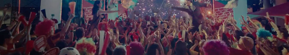
年代を跨いで同一会場で撮影を行う中でも、それぞれのシーンに明確な時代差と感情の熱量を生み出せるよう、美術設計や空間の情報量を細かく作り分けた。2014年のシーンでは、黄色をベースに原色を多用し、真夏の熱気や高揚感を感じさせるレトロポップな空気感を演出。対して2022年では、赤をテーマカラーに据え、ナイター特有の緊張感や都会的なムードを取り入れることで、スタイリッシュで現代的な世界観へと落とし込んだ。
また、一見すると気づかれない背景のポスターやグラフィックについても、年代ごとのデザイン傾向に合わせて字体やレイアウト、配色バランスを細かく調整。画面に映る情報の密度や視覚的ノイズまで設計することで、無意識のうちに時代の空気を感じ取れるような没入感を追求した。
さらに、単なる年代再現ではなく、サッカーとともに記憶に刻まれた興奮や期待感、その時代特有の熱気や熱量を空間全体で感じ取れるよう意識し、人の密度感や構図の勢いによって感情が画面全体から伝わる世界観を構築した。
時代を越えて感情が連続していくストーリー性を重視し、シーンごとの空気感や熱量が滑らかに繋がるよう構成することで、映像全体に流れと高い没入感を生み出した。
Inspired by FIFA World Cup host years, the project expressed the distinct atmosphere and cultural character of 2002, 2014, and 2022 through spatial direction and art design.
In alignment with Junichi Okada portraying himself from his teens through his thirties, the color palettes, material textures, and tones of props were carefully adjusted for each era to visually reconstruct the mood and temperature unique to those periods.
Despite filming across different eras within the same venue, the art direction and spatial density were meticulously differentiated to create a clear contrast in both period identity and emotional intensity.
The 2014 scenes adopted a yellow-based palette with vivid primary colors, creating a retro-pop atmosphere filled with the heat and excitement of midsummer. In contrast, the 2022 scenes centered around red tones, incorporating the tension of nighttime matches and an urban mood to establish a sleek and contemporary visual world.
Even background posters and graphics that were barely noticeable on screen were carefully refined to match the design tendencies of each era, including typography, layout, and color balance. By controlling the density of visual information and even the level of visual noise within the frame, the project pursued an immersive atmosphere that would subconsciously evoke the feeling of each time period.
Rather than simply recreating different eras, the project aimed to embody the excitement, anticipation, and emotional energy associated with memories of football culture. Through the density of people within the space and the momentum of each composition, a visual world was constructed in which emotion could be felt across the entire screen.
Emphasizing a sense of narrative continuity that transcends time, each scene was structured so that its atmosphere and emotional intensity flowed seamlessly into the next, creating a strong sense of immersion throughout the film.


